
Understanding Color Wheel Theory in Interior Decorating
Have you ever entered a room and immediately felt a sense of energy and vitality or perhaps had feelings of calm or peacefulness? Maybe you even felt a sense dread, fear or anger? What evokes those feelings – COLOR!
Colors can make a powerful statement or set a mood when entering a room. What do you want your room to say? How do you, your family and guests want to feel when they enter your room? Understanding color wheel theory in interior decorating is paramount before deciding on a color or color scheme for your space.
Meaning of Color
Colors have meaning from the objects we have assigned to them. For instance red is normally associated with fire and therefore con-notates a warm or hot feeling. Note we are talking from a Westerners point of view. Color can and does have different meaning in Eastern cultures and from region to region.
Professional designers have long known the influences of color on eliciting mode and ambiance. Now you can gain that same understanding before you undertake your next room design project. Let’s look at color and the emotions they evoke.
| Color | Variations | Western Meaning | Color Effects | Non-Western Meaning (1) |
| Red
|
|
Love, Passion, Warmth, Energy, Power, Excitement, Deteremination | Stimulates passion, assertive, aggressive, energizing, danger | Eastern: luck, prosperity, happiness, long life, fertility, power Some Africa: mourning |
| Orange
|
|
Activity, Energy, Youth, Fun, Confidence, Vitality, Courage | Offers emotional strength, optimism, physical confidence, competition and independence, youthfulness | Eastern: happiness, spiritual |
| Yellow
|
|
Joy, Happiness, Sunshine, Jealousy, Warning, Intellectual, Hunger | Feels uplifting and rejuvenating with mental clarity and intellect, enthusiasm. Warning. | Eastern: sacred, imperial, wisdom, male
Some Middle-East: mourning Africa: high rank France: jealousy Greece: sadness |
| Green
|
|
Environmental, Harmony, Nature, Health, Jealousy, Envy, Spring, Generosity, Family, Hope, Dependable, Wealth | Feelings of rebirth, nature, balance and equilibrium, warmth of family and friends, generosity of spirit and money, wealth, hope and harmony in life | Eastern: birth, hope, new beginnings, youth, immortality, fertility
Middle East: Islam, strength, luck, fertility, prestige Africa: corruption South America: death |
| Blue
|
|
Peace, Harmony, Professionalism, Trust, Security, Confidence, Order, Sky, Water, Cold, Technology, Depression, Loyalty, Stability, Masculinity, Protection, Relaxation, Communication | Feelings of peace, health, loyalty, confidence and professionalism. Could also elicit feelings of sadness and depression. Represents orderliness and conservation. | Eastern: immortality, life, feminine
Middle East: protection Mexico: mourning |
| Purple
|
|
Royalty, Nobility, Wisdom, Mystery, Wealth, Spirituality, Imagination, Luxury, Extravagance, | Inspires dreams, introspective, spirituality,mental balance and harmony. Can inspire empathy and dignity. | Eastern: wealth, privilege, sorrow, mourning Brazil: death, mourning |
| Brown
|
|
Earth, Nature, Outdoors, Hearth and Home, Security, Stability, Organic, Comfort, Practical, Orderliness, Organization, Chocolate, Coffee | Elicits feelings of organic, grounded, stability, durability and honesty. Comfortable and practical like a couch or chair. Careful as people often think of dirt. | Eastern: earth, mourning |
| Gray
|
|
Intelligence, Modesty, Maturity, Dignity, Compromise, Conventional, Practical, Dependable, Traditional, Loneliness, Impartial | Can represent compromise as its halfway between black and white. Elicits both feelings of drab and boring with upscale and elegance. | NA |
| Black
|
|
Power, Evil, Elegance, Sophistication, Strength, Morbidity, Night, Death, Control, Sexual, Affluent | Elicits feelings of hidden, secrecy, mystery and the unknown. It’s authority through fear. It can also be sophisticated, seductive, sexy and affluent. Also associated with “goth” in teenagers. | Eastern: wealth, health, boys, mystery, evil |
| White
|
|
Purity, Virginal, Ice, Cold, Clean, Peace, New, Wholeness, Completion, Calm, Reverence, Good, Humility, Sterility, Clinical, Institutional, Simplicity | Commonly worn by brides and new babies. Found in medical facilities for institutional and cleanly feeling. Feelings of good, newness, virginal and pure. | Eastern: death, mourning, funerals, sadness, purity, age, misfortune Middle East: purity, mourning |
| Pink
|
|
Compassion, Love, Nurturing, Feminine, Caring, Assurance, Sweetness, Youthfulness, Fun, Excitement | It elicits motherhood, nurturing and caring feelings. It is compassionate, calming and reassuring. | Belgium: boys (rest of Europe is girls) |


Color Variations – Tints, Tones and Shades
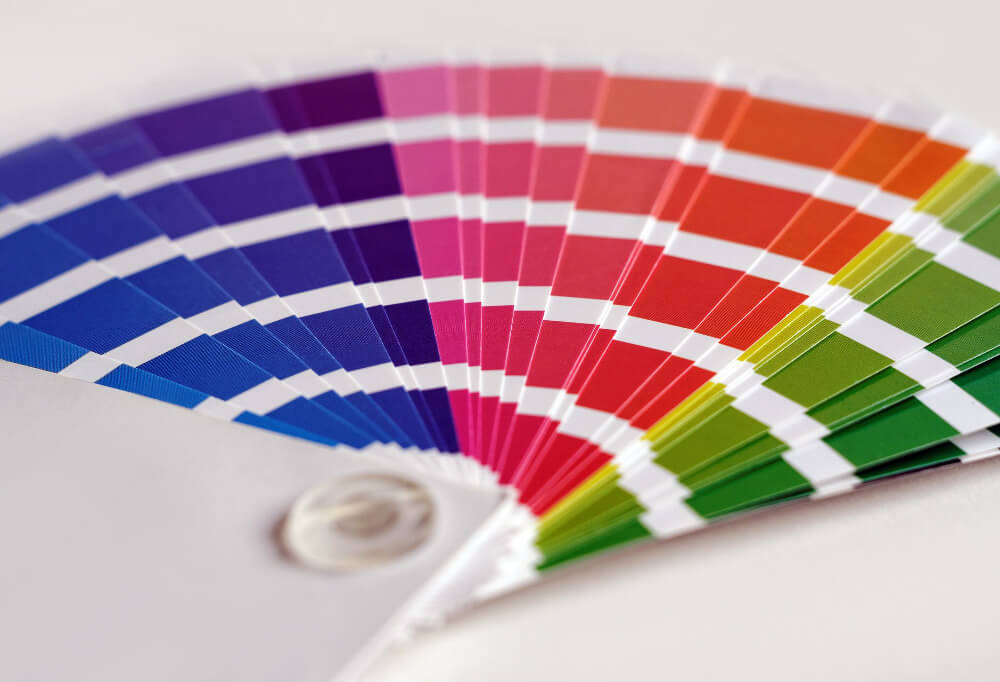
We have explored colors, its meaning (in both Western and non-Western cultures) and the emotions they can elicit under certain circumstances. Before you jump into picking a color for your walls, furniture or accessories you will need to understand the importance of color variations and how applying them to your color will change your emotion, mood and ambiance. Let’s take a look at hues, tints, tones and shades of color in our understanding color wheel theory in interior decorating article.
Color is every hue, tint and shade we see, which includes white, black and gray.
Hue refers to the dominant color family we are observing, which does not include black, white and gray. It is the six primary and secondary colors we see on a standard color wheel – Yellow, Orange, Red, Violet, Blue or Green.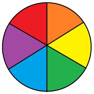
Tints, often referred to as pastels, are a mixture of a hue with pure white. Adding white lightens, but never brightens a hue color. It only makes it paler. In fact you can dramatically change the color from something close to the original hue all the way down to almost being white.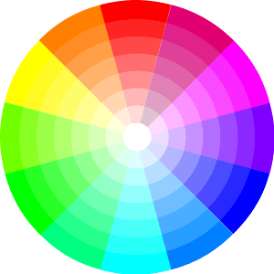
Tones refer to color hues produced by taking an original color and adding pure gray. The gray is a pure mix of white and black with no other colors added. Adding gray to color will tone down the intensity of the color. Be careful not to add too much as it will greatly dull the color and may become a bit depressive. Most adults find slightly toned colors more eye pleasing as opposed to natural color hues, which are more pleasing to children.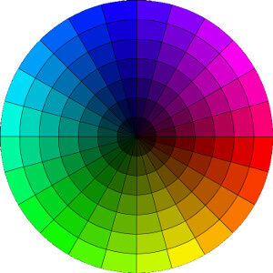
Shades are derived from mixing color hues with pure black, no white or gray additives. Adding black will make your color a darker version of itself. This means your color can range from close to its original color all the way to black.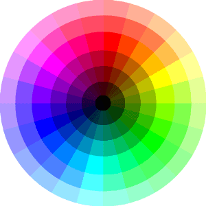
There are additional color considerations such as saturation, lightness, chroma, brightness and intensity but for our purposes of choosing colors to decorate our spaces we will focus on hues, tints, tones and shades. The rest we will leave to painters and cinematographers.
The “Feeling” of Color Variations
Standard dominant color hues (the six basic colors of the wheel) were our basic building blocks of color when we were young. They are vibrant, stimulating and good learning tools for the young. However, as we get older our tastes change and we see color differently. We tend to be drawn to colors that are muted and appeal to evolved selves. These muted or changed colors from the standard color wheel now elicit different feelings.
Darker colors:
- darker reds, like burgundy, or purples, like plum, show opulence or wealth
- darker reds, like blood red, denote anger, danger and frustration
- darker grays and browns tend to denote poverty or sadness
Brighter colors:
- bright reds denote 1) hot and spicy temperatures to heat up a room or 2) love, passion and power
- light grays can be soothing and calming
- lighter purples can be romantic and nostalgic
- brighter blues denote health, calm, peace, tranquility
So you can see the difference in “feelings” evoked when you change the same color from dark to light. Darker colors also weigh down a room while lighter brighter colors will lighten the weight of the room.
Do you have a favorite season?
Seasonal color impacts:
- Spring: Pastel and light shades are springtime colors
- Summer: brighter shades of the primary colors
- Fall: earth-tone shades of brown, yellow and orange (like nature)
- Winter: cooler shades of white, black and blue
Combining Colors
Complementary Colors
Complementary colors combine two colors on the color that are directly opposite each other. The high contrast of these colors can make a space pop with color. Complementary colors are good for smaller spaces and may be too shocking in larger spaces.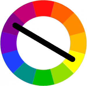
Analogous Colors
Analogous colors use three colors directly next to each other on the color wheel. These colors create and eye-pleasing harmonious look in your space. One color should be made dominant with the other two for support. Blacks, white and gray colors can be mixed in with one of the colors for extra pop.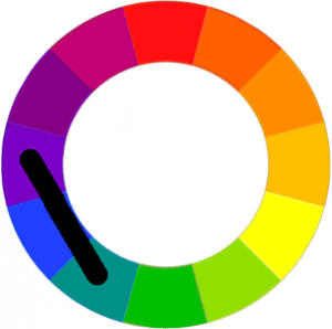
Triad Colors
Triad colors use three colors evenly spaced around the color wheel. These colors can create a vibrant pop of color to your room. Like analogous colors, you should choose one to be your dominant color with the other two playing a support role.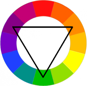
Monochromatic Colors
The essence of a monochromatic palette uses shades of the same color to decorate a space. Which color to pick largely depends on your favorite color and the ambiance or mood your are trying to create in your room.
Understanding Color Wheel Theory in Interior Decorating Conclusion
We have looked at color and its meaning both in Western and non-Western cultures. Not only do we need to choose a color that represents either our favorite or a particular mood for a space but we need to decide a tint, tone or shade that further defines the exact mood or feeling we want in our space. Once we know our desired color, how will we use it? We will choose to pair it in a complementary scheme, or use two supporting colors in a triad scheme or choose two colors on either side of the wheel or perhaps consider color variations of the same color chosen?
As you can see there are many factors to consider to when choosing a color palette or scheme. Understanding color wheel theory in interior decorating is very important if we want to create that perfect space for us, our family and our guests!
Resources:
- Canva – Color Wheel
- Color Matters – Basic Color Theory
- HGTV.com – 15 Designer Tricks for Picking a Perfect Color Palette
References:
(1) Changing Minds – The Meaning of Color